This short blog post will show you how to utilize Bootstrap to create a small and reuseable ModalDialogComponent.
Maybe for startes: What is a modal dialog?Found here
A modal dialog is a dialog that appears on top of the main content and moves the system into a special mode requiring user interaction. This dialog disables the main content until the user explicitly interacts with the modal dialog.
That means when we open the dialog only elements on this dialog should be interactable. The good news is, that we don't have to take care of it so much as Bootstrap brings all the utilities with it to deal with that problem.
Build the component
Let's create a new component under Shared named ModalDialog. We want to receive two parameters: a header title and we want to add dynamic content to our modal dialog. Also we need a way to open and close the dialog:
@code {
    [Parameter]
    public string Title { get; set; }

    [Parameter]
    public RenderFragment ChildContent { get; set; }

    public void Open()
    {
    }

    public void Close()
    {
    }
}
What does open and close mean in our context of a modal dialog? It is quite simple: When we open the dialog, we basically make the dialog visible and we close it, well we just remove it from the display. But the dialog itself will be always available, we will just switch between its visibility state and we do this via normal css display attribute. I also said that Bootstrap an take care of most of the problems and also Bootstrap does that via css classes. So everytime we open or close the dialog we add the specific Bootstrap classes or remove it. And there are exactly two classes we need
The RenderFragment ChildContent enables the component to "host" other HTML or Blazor components inside without knowing explicitly what are those components. If you want to know more check out the ASP.NET Core documentation.
What we also need is the ability to disable clicks in the "back". So everything which is not in our modal dialog. Don't worry Bootstrap got us covered here as well. They have a css class called modal-backdrop for exactly that. So with those information we can build our code behind:
@code {
    [Parameter]
    public string Title { get; set; }

    [Parameter]
    public RenderFragment ChildContent { get; set; }

    private string modalDisplay = "none;";
    private string modalClass = string.Empty;
    private bool showBackdrop = false;

    public void Open()
    {
        modalDisplay = "block";
        modalClass = "show";
        showBackdrop = true;
    }

    public void Close()
    {
        modalDisplay = "none";
        modalClass = string.Empty;
        showBackdrop = false;
    }
}
And now we only need the last part: The html code:
<div class="modal @modalClass" tabindex="-1" role="dialog" style="display:@modalDisplay; overflow-y: auto;">
    <div class="modal-dialog modal-lg" role="document">
        <div class="modal-content">
            <div class="modal-header">
                <h5 class="modal-title">@Title</h5>
                <button type="button" class="btn-close" data-dismiss="modal" aria-label="Close" @onclick="Close">
                </button>
            </div>
            <div class="modal-body">
                @ChildContent
            </div>
        </div>
    </div>
</div>

@if (showBackdrop)
{
    <div class="modal-backdrop fade show"></div>
}
The modal dialog and how it is constructed is solely taken from the Bootstrap example.
?? Yeah. Our component is done!
Usage
As we have our component, we only need to use it once. And that is fairly easy:
<button class="btn btn-primary">Open Dialog</button>
<ModalDialog Title="Hello World">
    <p>Here some content</p>
</ModalDialog>
Now the only problem is: how do we open the dialog? Because the shown example will do basically nothing. So we need a reference to our dialog to invoke the Open method of that instance. And sure Blazor offers us the possibility to get a reference to an element via the @ref attribute.
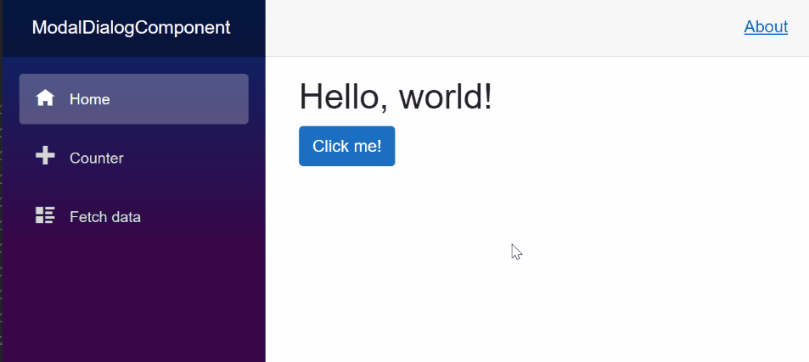
Here the complete example:
@page "/"

<PageTitle>Index</PageTitle>

<h1>Hello, world!</h1>

<button class="btn btn-primary" @onclick="() => ModalDialog.Open()">Click me!</button>

<ModalDialog @ref="@ModalDialog" Title="Hello World">
    <div class="row">
        <h3>Lorem Ipsum</h3>
        <hr>
        <p>Lorem ipsum dolor sit amet, consectetur adipiscing elit. Nunc vel ultricies sapien. Duis nec nunc erat. Vivamus eget sem tristique, lacinia mi id, cursus eros.</p>
        <button class="btn btn-primary"  @onclick="() => ModalDialog.Close()">Close</button>
    </div>
</ModalDialog>

@code {
    private ModalDialog ModalDialog { get; set; }
}
Result
Here the final result: