In this blog post we will create a ToolTip component in Blazor from scratch. We will use the Blazor WebAssembly template to create a new project. We will then add a ToolTip component to the project and use it in the Index page. We will also add some styling to the ToolTip component.
The advantage over using a library is that we can customize the component to our needs as well as keeping it simple! So let's get started!
Why a ToolTip Component?
A ToolTip component is a small popup that appears when you hover over an element. It can be used to provide additional information about an element. For example, you can use it to show the full name of a person when you hover over their initials. Or you can use it to show the full name of a country when you hover over its flag. From a UX perspective, it is a great way to provide additional information without cluttering the page.
Usage
I like to start from the consumer point of view rather than the implementation point of view. So let's see how we can use the ToolTip component in our application. I want to use the component as follows:
<ToolTip Tip="Here goes the hint">
    <button>Hover over me</button>
</ToolTip>
Also I want to allow other Blazor components to be used as the content of the ToolTip component. For example, I want to use the following markup:
<ToolTip Tip="Here goes the hint">
    <MyComponent />
</ToolTip>
Creating the component
Let's get started by creating a new ToolTip component. The behavior of the component is as follows:
- When the user hovers over the content of the ToolTip component, the ToolTip component should show the hint after a delay.
- When the user moves the mouse away from the content of the ToolTip component, the ToolTip component should hide the hint.
With these two factors we know we should utilize the onmouseouver and onmouseout events. To allow arbitrary content to be used as the content of the ToolTip component, we should use the RenderFragment type. There is a special ChildContent property that we can use to get the content of the component. As long as you call the RenderFragment parameter ChildContent you can use the "nested" syntax as described above without naming the parameter itself.
Let's go with the HTML part:
<div class="tooltip-container" @onmouseover="ShowToolTip" @onmouseout="HideToolTip">
    <div class="tooltip-content">
        @ChildContent
    </div>
    <div class="tooltip-text" style="display:@(_isToolTipVisible ? "block" : "none");">@Tip</div>
</div>
The tooltip-container class is used to position the ToolTip component relative to the content. The tooltip-content class is used to style the content of the ToolTip component. The tooltip-text class is used to style the hint of the ToolTip component. The style attribute is used to show or hide the hint of the ToolTip component. That leaves us with the logic part:
@code {
    [Parameter] public string Tip { get; set; }
    [Parameter] public RenderFragment ChildContent { get; set; }

    private bool _isToolTipVisible = false;
    private bool _isMouseOver = false;
    private const int ToolTipDelay = 500;

    private async Task ShowToolTip(MouseEventArgs e)
    {
        _isMouseOver = true;
        await Task.Delay(ToolTipDelay);

        if (_isMouseOver)
        {
            _isToolTipVisible = true;
            StateHasChanged();
        }
    }

    private void HideToolTip(MouseEventArgs e)
    {
        _isMouseOver = false;
        _isToolTipVisible = false;
    }
}
The ShowToolTip method is called when the user hovers over the content of the ToolTip component. It sets the _isMouseOver flag to true and waits for the ToolTipDelay to pass. If the _isMouseOver flag is still true it sets the _isToolTipVisible flag to true and calls StateHasChanged to update the UI. The HideToolTip method is called when the user moves the mouse away from the content of the ToolTip component. It sets the _isMouseOver flag to false and sets the _isToolTipVisible flag to false.
The last thing missing is the style. For this we create a new file called ToolTip.razor.css and add the following style:
.tooltip-container {
    position: relative;
    display: inline-block;
}

.tooltip-content {
    cursor: pointer;
}

.tooltip-text {
    visibility: hidden;
    position: absolute;
    background-color: #555;
    color: #fff;
    text-align: center;
    padding: 5px;
    border-radius: 4px;
    z-index: 1;
    bottom: 125%;
    left: 50%;
    margin-left: -60px;
    opacity: 0;
}

.tooltip-container:hover .tooltip-text {
    visibility: visible;
    opacity: 1;
}
For starters this is good enough. We can always improve the style later on. In this stage you will run into issues if the content of the ToolTip component is wider than the hint.
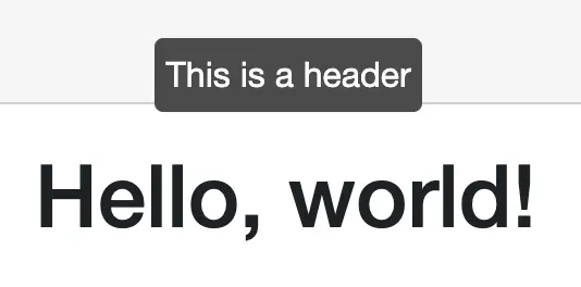
Now if we use it like this:
<ToolTip Tip="This is a header">
    <h1>Hello, world!</h1>
</ToolTip>
And hover over the header, we get the following result:
Conclusion
In this blog post we created our own small ToolTip component. We used the ChildContent parameter to allow arbitrary content to be used as the content of the ToolTip component. We also used the onmouseover and onmouseout events to show and hide the hint of the ToolTip component. The source code, as always, is linked below.