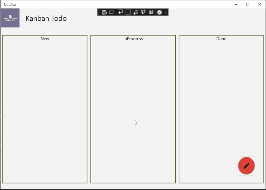
In the last part of the series we layed some ground work. We were able to have the basic constuct available, but still there was no user interaction possible. In this part of the series we will change this. To know where we are going, let's have a look at this small sneak peak:
Creating the dialog component
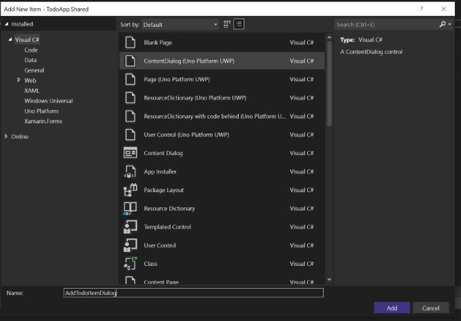
First we need to add a new ContentDialog to our project. As with UserControl elements you can just right click on your Shared project and press Add.
There you can find the ContentDialog template offered by the Uno Platform.
Once created switch to your newly created file. You will see something like this:
<ContentDialog
    x:Class="TodoApp.ContentDialog1"
    xmlns="http://schemas.microsoft.com/winfx/2006/xaml/presentation"
    xmlns:x="http://schemas.microsoft.com/winfx/2006/xaml"
    xmlns:local="using:TodoApp"
    xmlns:d="http://schemas.microsoft.com/expression/blend/2008"
    xmlns:mc="http://schemas.openxmlformats.org/markup-compatibility/2006"
    mc:Ignorable="d"
    Title="TITLE"
    PrimaryButtonText="Button1"
    SecondaryButtonText="Button2"
    PrimaryButtonClick="ContentDialog_PrimaryButtonClick"
    SecondaryButtonClick="ContentDialog_SecondaryButtonClick">

    <Grid>
    </Grid>
</ContentDialog>
The ContentDialog brings a lot of utility with it. You can see that we change for example the Title, or PrimaryButtonText so let's do this for now.
I also remove the two Click event handlers. We will re-add them later with some more useful logic. Your xaml should look similar to this:
<ContentDialog
    x:Class="TodoApp.AddTodoItemDialog"
    xmlns="http://schemas.microsoft.com/winfx/2006/xaml/presentation"
    xmlns:x="http://schemas.microsoft.com/winfx/2006/xaml"
    xmlns:local="using:TodoApp"
    xmlns:mc="http://schemas.openxmlformats.org/markup-compatibility/2006"
    Title="Add new todo item"
    PrimaryButtonText="Add"
    IsPrimaryButtonEnabled="False"
    SecondaryButtonText="Cancel"
Now that we have the skeleton of our ContentDialog we can display it. You remember in the last part where we created the stylish button? We will leverage this button to do some actual code now. Go to your AddTodoItem.xaml and add a Click event to the button like this: <Button Width="64" Height="64" HorizontalAlignment="Stretch" VerticalAlignment="Stretch" Click="OpenDialog">. The only part missing now is that we have to declare a method in the code-behind file AddTodoItem.xaml.cs to open our newly created magic. For that we will create the OpenDialog method and do the following:
private void OpenDialog(object sender, RoutedEventArgs args)
{
    var dialog = new AddTodoItemDialog();
    dialog.ShowAsync();
}
We just create a new instance of our AddTodoItemDialog and call ShowAsync. Now you can compile your code and try out your button:
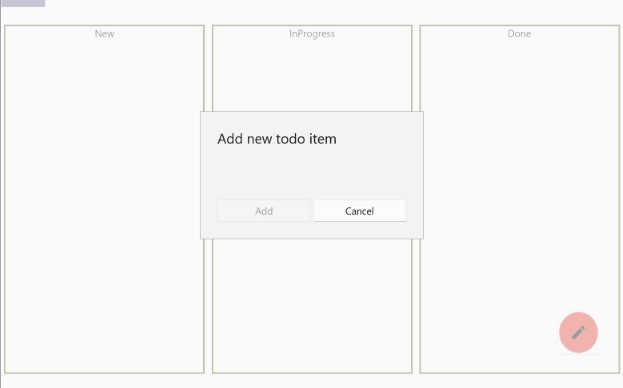
Now that doesn't look to bad, does it? In my example the Add button is disabled because is set theIsPrimaryButtonEnabled="False" in the ContentDialog. Now the next step is to fill our dialog with a bit of live.
Let's add all the controls necessary to create a new todo item. Afterwards we will take care of our View-Model including some validation. Right now I want three things from the user:
- The title, which is mandatory
- A due date, which is optional
- A description, which can be longer (multiline support) and is also mandatory
For beginners we will use a simple
Gridlayout to align all the items:
<ContentDialog
    x:Class="TodoApp.ContentDialog1"
    xmlns="http://schemas.microsoft.com/winfx/2006/xaml/presentation"
    xmlns:x="http://schemas.microsoft.com/winfx/2006/xaml"
    xmlns:local="using:TodoApp"
    xmlns:mc="http://schemas.openxmlformats.org/markup-compatibility/2006"
    xmlns:controls="using:MADE.UI.Controls"
    Title="Add new todo item"
    PrimaryButtonText="Add"
    IsPrimaryButtonEnabled="False"
    SecondaryButtonText="Cancel">

    <Grid Margin="10">
        <Grid.ColumnDefinitions>
            <ColumnDefinition Width="Auto" />
            <ColumnDefinition Width="10" />
            <ColumnDefinition Width="*" />
        </Grid.ColumnDefinitions>
        <Grid.RowDefinitions>
            <RowDefinition Height="Auto" />
            <RowDefinition Height="10" />
            <RowDefinition Height="Auto" />
            <RowDefinition Height="10" />
            <RowDefinition Height="*" />
        </Grid.RowDefinitions>

        <TextBlock Grid.Row="0" Grid.Column="0" Text="Title:" />
        <TextBox Grid.Row="0" Grid.Column="2"/>

        <TextBlock Grid.Row="2" Grid.Column="0" Text="Due Date:" />
        <DatePicker Grid.Row="2" Grid.Column="2"/>

        <TextBlock Grid.Row="4" Grid.Column="0" Text="Description:" />
        <TextBox Grid.Row="4" Grid.Column="2" AcceptsReturn="True" TextWrapping="Wrap" />
    </Grid>
</ContentDialog>
We have 3 columns and 5 rows. I use the first column for our labels and the last column for the input controls. The second column is solely to have some space in between... so purely optical reason. You can of course also work with padding or margin, whatever you prefer. The same I do with the rows. Every second row is just to have some space in between so it looks more appealing. Only the last row is important. Our last TextBox is meant for the description, which allows multiline (AcceptsReturn="True"), therefore it can grow in size. The grid should take this into account, therefore the "*" as Height for that specific row. If we compile the result and run our example you will see something like this:
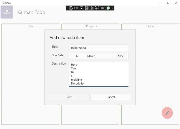
That looks pretty nice, doesn't it? Of course if you wish you can extend this to all the attributes you would like to ask from the user. I wanted to have the minimal amount.
The next step is to create a view model which later holds the data and can be utilized for validation. Before we do that let's import two nuget packages. We are using them to make our validation simpler and add INotifyPropertyChanged out-of-the-box.
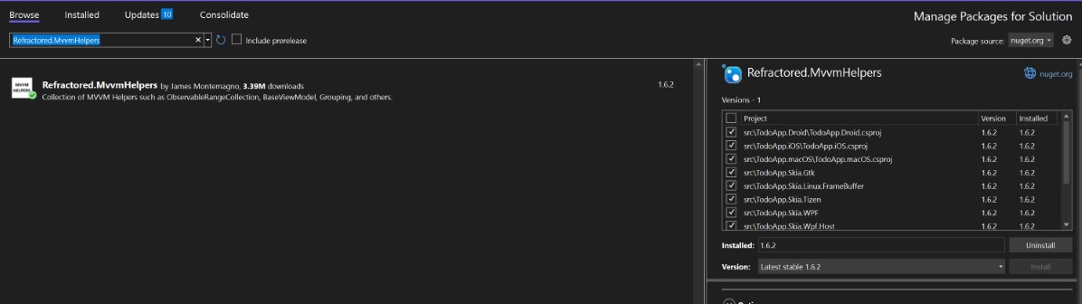
Refractored.MvvmHelpersfor the observable pattern. On the official Uno Platform site you can find out moreMADE.UI.Controls.Validatorfor validation.
As said in part 1 the Shared project itself is just a container so you can't add references to it. Instead you will add all the necessary nuget package to all Head projects.
ViewModel & Validation
I basically took the tutorial from James Croft to enable validation in my form. There are plenty of ways, I just found it appealing to try out his MADE package.
Create now a new normal class named NewTodoItemViewModel. I will show you the code now and will explain bit by bit afterwards:
using MADE.Data.Validation;
using MADE.Data.Validation.Validators;
using MvvmHelpers;
using System;

namespace TodoApp
{
    public class NewTodoItemViewModel : ObservableObject
    {
        private string title;
        private string description;
        private DateTimeOffset dueDate;
        private bool isTitleValid;
        private bool isDescriptionValid;
        private bool isViewModelValid;

        public NewTodoItemViewModel()
        {
            TitleValidators.Validated += ValidateTitle;
            DescriptionValidators.Validated += ValidateDescription;
        }


        public string Title
        {
            get => title;
            set
            {
                SetProperty(ref title, value);
            }
        }

        public string Description
        {
            get => description;
            set
            {
                SetProperty(ref description, value);
            }
        }

        public DateTimeOffset DueDate
        {
            get => dueDate;
            set
            {
                SetProperty(ref dueDate, value);
            }
        }

        public bool IsTitleValid
        {
            get => isTitleValid;
            set
            {
                SetProperty(ref isTitleValid, value);
            }
        }

        public bool IsDescriptionValid
        {
            get => isDescriptionValid;
            set
            {
                SetProperty(ref isDescriptionValid, value);
            }
        }

        public bool IsViewModelValid
        {
            get => isViewModelValid;
            set
            {
                SetProperty(ref isViewModelValid, value);
            }
        }

        public ValidatorCollection TitleValidators { get; } = new ValidatorCollection() { new RequiredValidator(), new MinLengthValidator(4) };
        public ValidatorCollection DescriptionValidators { get; } = new ValidatorCollection() { new RequiredValidator(), new MinLengthValidator(10) };

        private void ValidateTitle(object sender, InputValidatedEventArgs args)
        {
            IsTitleValid = !TitleValidators.IsInvalid;
            UpdateIsViewModelValid();
        }

        private void ValidateDescription(object sender, InputValidatedEventArgs args)
        {
            IsDescriptionValid = !DescriptionValidators.IsInvalid;
            UpdateIsViewModelValid();
        }

        private void UpdateIsViewModelValid()
        {
            IsViewModelValid = IsTitleValid && IsDescriptionValid;
        }
    }
}
We will derive from ObservableObject which comes from the Refractored.MvvmHelpers package. This will give use the SetProperty function. It basically does all the INotifyPropertyChanged stuff you would normally do on your own.
So this is the typical MVVM pattern you would do with any WPF/XAML application.
Our viewmodel has 2 responsbilities:
- Holding the data via
Title,DescriptionandDueDate. - Do validation. For that we have two
ValidatorCollections. One (TitleValidators)for checking whether the title is valid and theDescriptionValidatorsfor the description. We have the opportunity to pass in multiple validators at the same time. In our case we want to express: Hey theTitleis mandatory and has to have at least 4 characters. The same applies to ourDescriptionbut it should have at least 10 characters. If you want to know more check out the Validators on the repository. In our constructor we are also chaining some events viaTitleValidators.Validated += ValidateTitle;andDescriptionValidators.Validated += ValidateDescription;. This events gets triggered by the library when the underlying property is changing. We will see later in the frontend code how this is done. For now we have to know that we want to have theIsValidproperty for both of our properties. And we also want an overallIsViewModelValidwhich is only true when both theTitleand theDescriptionis valid. We will use this property to toggle theAddbutton. If our model is not valid we will not be able to add an item. Bottom line: Our property is changing, then all the validators in ourValidatorCollectionget triggered and we save it to a property.
Now the last bit, the frontend-code. We have to wrap our components with the InputValidator also provided by the MADE.UI.Controls.Validator library.
<ContentDialog
   x:Class="TodoApp.AddTodoItemDialog"
   xmlns="http://schemas.microsoft.com/winfx/2006/xaml/presentation"
   xmlns:x="http://schemas.microsoft.com/winfx/2006/xaml"
   xmlns:local="using:TodoApp"
   xmlns:mc="http://schemas.openxmlformats.org/markup-compatibility/2006"
   xmlns:controls="using:MADE.UI.Controls"
   Title="Add new todo item"
   PrimaryButtonText="Add"
   IsPrimaryButtonEnabled="False"
   SecondaryButtonText="Cancel">

   <Grid Margin="10">
       <Grid.ColumnDefinitions>
           <ColumnDefinition Width="Auto" />
           <ColumnDefinition Width="10" />
           <ColumnDefinition Width="*" />
       </Grid.ColumnDefinitions>
       <Grid.RowDefinitions>
           <RowDefinition Height="Auto" />
           <RowDefinition Height="10" />
           <RowDefinition Height="Auto" />
           <RowDefinition Height="10" />
           <RowDefinition Height="*" />
       </Grid.RowDefinitions>

       <TextBlock Grid.Row="0" Grid.Column="0" Text="Title:" />
       <controls:InputValidator Grid.Row="0" Grid.Column="2"
                                Input="{x:Bind titleTextBox.Text, Mode=TwoWay, UpdateSourceTrigger=PropertyChanged}"
                                Validators="{x:Bind viewModel.TitleValidators}">

           <TextBox x:Name="titleTextBox" Text="{x:Bind viewModel.Title}"/>
       </controls:InputValidator>

       <TextBlock Grid.Row="2" Grid.Column="0" Text="Due Date:" />
       <DatePicker Grid.Row="2" Grid.Column="2"/>

       <TextBlock Grid.Row="4" Grid.Column="0" Text="Description:" />
       <controls:InputValidator Grid.Row="4" Grid.Column="2"
                                Input="{x:Bind descriptionTextBox.Text, Mode=TwoWay, UpdateSourceTrigger=PropertyChanged}"
                                Validators="{x:Bind viewModel.DescriptionValidators}">
           <TextBox x:Name="descriptionTextBox" AcceptsReturn="True" TextWrapping="Wrap" Text="{x:Bind viewModel.Description}"/>
       </controls:InputValidator>
   </Grid>
</ContentDialog>
We can see that our TextBox got wrapped by the InputValidator. The InputValidator is directly bound to the Text property of the TextBox. As you can see we are also declaring which validators will be invoked via the Validators property. The drawback of this approach is, that if you need an aggregated IsValid flag over all your properties you have to create one ValidatorCollection for each property you have.
If you compile the whole solution again and run the project you will have the same picture as on the very top of this page 😉
With that we conclude this part of the series. We successfully implemented a nice modal dialog which works an all platforms which allows the user to enter basic information about the todo item they want to track with our little app.
What's next
Now we created a new todo item, but it is nowhere displayed. We can also not really interact or keep track of the current state. This will be part of our next episode in the series.