Welcome to our second part of our small Todo app - Kanban style which we implement with the UNO platform. If you missed the first part, check out this part to catch up. In the first part I explained what exactly the UNO Platform is and how we can setup our IDE to start developing our small multi-platform app.
The second part will focus mainly on our first features. We want to be able to add our first Todo item. As this small mini series will showcase the UNO Platform itself the code and the requirements are rather simple.
Domain object and requirements
Before we style anything we need to gather some requirements. With this requirements we can model a part of our domain model.
- We need some basic information for our Todo items like
- Short title and a more detailed description
- A due date and if we are overdue we want to see that
- We, of course, also need a way to create new items
- As we are doing Kanban style we need some kind of swimlanes. Those swimlanes represent basically a state in which our todo items are. To simplify we will have 3 presets: New, In Progress and Done.
- Newly created Todo items are automatically declared as new and should be display in the corresponding swimlane
- When we click on a todo item we should see details (basically our
Description) - In Kanban the item on the top is the most important. So we need a mechanism of priority and also to re-order / re-prioritize items
- We need to move our items from one lane to another to indicate the state change
- We also need an option to delete a todo item
- All progress should be saved and we open the app again we should see our last entries
Basic information / domain object
For starters we need a domain object which represents all our requirements discussed in the last part. So we create new file in our Shared project were most of the magic will happen.
Our Todo class will live under TodoApp.Shared/Domain/Todo.cs and will have the following properties (for now 😉 ).
using System;

namespace TodoApp.Domain
{
    public enum KanbanState { New, InProgress, Done }

    public class Todo
    {
        public string Title { get; set; }

        public string Description { get; set; }

        public KanbanState KanbanState { get; set; }

        public DateTime? DueDate { get; set; }

        public bool IsOverdue => (DueDate ?? DateTime.MaxValue) < DateTime.Now;
    }
}
Now we have our basic object we will deal with. It has a Title we can display, as well as a Description. You could also introduce tags or categories, but we keep it simple for now.
Our main page
Our main page is empty right now. We need a few things like our swimlanes which will hold our todo items. Also we want to have a nice title bar with a logo.
Logo
Before we adopt any code at the MainPage.xaml lets create our new TitleBar.xaml. This is basically a logo and a small text. To add a new user control, just right-click on your Shared project and add a new User Control.
The control itself is pretty simpled:
<UserControl
    x:Class="TodoApp.TitleBar"
    xmlns="http://schemas.microsoft.com/winfx/2006/xaml/presentation"
    xmlns:x="http://schemas.microsoft.com/winfx/2006/xaml"
    xmlns:d="http://schemas.microsoft.com/expression/blend/2008"
    xmlns:mc="http://schemas.openxmlformats.org/markup-compatibility/2006"
    mc:Ignorable="d"
    d:DesignHeight="300"
    d:DesignWidth="400">

    <StackPanel Orientation="Horizontal">
        <Image Width="64" Height="64" Source="we will fill this in a second"></Image>
        <TextBlock VerticalAlignment="Center"
                   Margin="20,0,0,0"
                   Text="Kanban Todo"
                   FontSize="24"></TextBlock>
    </StackPanel>
</UserControl>
We are utilizing a StackPanel which breaks elements on the horizontal axis. If you are a web developer you can imagine this as a flexbox. In our "flexbox" we have two elements: The image itself and a small text which is basically our title. The way how assets work in the UNO Platform is really cool. If you are interested in the details have a look here. To put it simply the UNO Platform utilizes how assets are handled in UWP but streamlines this over all the platforms. The link gives you a nice overview what works and what doesn't work due to the limitations of the underlying API / hardware. For example: webp works well on Windows or Android but faces limitations on WASM. The limitation is not the UNO Platform itself but the underlying browser. If you have an old browser, chances are it doesn't support webp.
Anyway the UNO Platform can take care of a lot of things for you, which is in my opinion a very big plus:
- Automatic scaling via naming convention
- Different images for different cultures
- Dark theme support! Yes dark theme support!
- Also if you need different images depending on the platform it gets executed, they also got you covered!
Now lets add our image to our Shared-Project. We can do this easily via right-click on the Assets folder and add an existing item. Therefore you should put your image under this Assets folder.
You can also find a readme there which gives you a small instruction that your images should be labeled as Content so that the MSBuild targets pick those images up and bundle them together for your target platform.
We have now our image added to Assets but what is missing is, that we still have to use it. And we do so, as you might suspect, in the "UWP-Style". For our image this should look now in the end like this:
<Image Width="64" Height="64" Source="ms-appx:///Assets/logo.png"></Image>
Done! I mean almost done. We created our TitleBar user control but we are not using it anywhere. For that we have to extend our MainPage.xaml which only greeted us until now.
Maybe I should have said this earlier, but when I create visual UI's, then for 99% of the cases this are websites. Therefore I will use the same approach as I would on a website.
Therefore I remove the Grid from our MainPage and replace it with a StackPanel. Now it kind of behaves like div's 😄
<Page
    x:Class="TodoApp.MainPage"
    xmlns="http://schemas.microsoft.com/winfx/2006/xaml/presentation"
    xmlns:x="http://schemas.microsoft.com/winfx/2006/xaml"
    xmlns:local="using:TodoApp"
    xmlns:d="http://schemas.microsoft.com/expression/blend/2008"
    xmlns:mc="http://schemas.openxmlformats.org/markup-compatibility/2006"
    mc:Ignorable="d"
    Background="{ThemeResource ApplicationPageBackgroundThemeBrush}">

    <StackPanel>
        <local:TitleBar></local:TitleBar>
    </StackPanel>
</Page>
Now that we are set, let's compile and start. Depending on the startup project you selected, you should have the following picture:
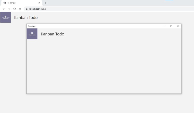
As you can see I launched the WASM project, as well as the UWP project and both just work. I like it! Also you don't have to close and restart your apps all the time. Hot reload is supported.
Swimlanes!
The central part of our application is managing our todo items in multiple so called swimlanes. We make it very simple in our small application, we have 3 well defined presets (New, In Progress and Done). So we will also need three swimlanes. A swimlane itself is rather "stupid". It should consist out of the tile and will hold all the todo items which are in its state. Later on we will see that we make it a bit smarter by introducing drag and drop! This is where the real magic happens 😉
Let's add a new file our Swimlane user control. We do it exactly like earlier with the TitleBar via Right-click TodoApp.Shared > Add > New item > User control
Our swimlane needs two things. The first is we need to set a KanbanState for which the specific Swimlane is responsible. Second: we need some items we want to display. Those items have to be filtered depending on the KanbanState set to the component. Let's start with the easy one and introduce the Swimlane. We will use this state as a title for the swimlane itself.
Swimlane.xaml:
<UserControl
    x:Class="TodoApp.Swimlane"
    xmlns="http://schemas.microsoft.com/winfx/2006/xaml/presentation"
    xmlns:x="http://schemas.microsoft.com/winfx/2006/xaml"
    xmlns:local="using:TodoApp"
    xmlns:d="http://schemas.microsoft.com/expression/blend/2008"
    xmlns:mc="http://schemas.openxmlformats.org/markup-compatibility/2006"
    mc:Ignorable="d"
    d:DesignHeight="300"
    d:DesignWidth="400">

    <StackPanel MinWidth="200" MinHeight="500" BorderBrush="DarkOliveGreen" BorderThickness="2">
        <TextBlock Text="KanbanState Title" HorizontalAlignment="Center"></TextBlock>
    </StackPanel>
    <ListView>
            <!-- Here goes our todo item content -->
        </ListView>
</UserControl>
Our Swimlane is super easy. It is also a StackPanel which will (for now) consist out of two elements:
- A title which we have to set to our
KanbanState. We will do this in a second - A
ListViewwhich is responsible for our todo items itself.
Until now we have no way of telling our component for which KanbanState we are responsible for. So we will introduce a new property which can be set by the parent XAML component. We do this as you would expect in the WPF world via a DependencyProperty Let's go to our code behind and add one.
Swimlane.xaml.cs
namespace TodoApp
{
    public sealed partial class Swimlane : UserControl
    {
        public Swimlane()
        {
            InitializeComponent();
        }

        public static readonly DependencyProperty KanbanStateProperty = DependencyProperty.Register(nameof(State), typeof(KanbanState), typeof(Swimlane), new PropertyMetadata(KanbanState.New));

        public KanbanState State
        {
            get { return (KanbanState)GetValue(KanbanStateProperty); }
            set { SetValue(KanbanStateProperty, value); }
        }
    }
}
Super straight forward. Now this allows us to bind the KanbanState in the XAML code and also enables the parent component to set the KanbanState for which this specific component is responsible for.
For both goals we are doing plain standard XAML stuff. Lets adopt the TextBlock in our Swimlane to this: <TextBlock Text="{x:Bind State}" HorizontalAlignment="Center"></TextBlock>. The Bind expression binds our KanbanState State property to the specific TextBlock.
The last step is to add those Swimlanes to our MainPage. So lets do this.
Initially I choose a StackPanel and our only item until now is the TitleBar. That worked great, but the StackPanel has a very big shortcoming. It is hard (without overriding some methods like Measure and Arrange) to tell it something like: "If you have 3 children, then every child should make up 33% of the total width". To come around that shortcoming we will use a Grid and tell the Grid exactly that:
MainPage.xaml
<StackPanel>
    <local:TitleBar></local:TitleBar>
    <Grid Margin="0,20,0,0">
        <Grid.Resources >
            <Style TargetType="Border" >
                <Setter Property="Padding" Value="5,5,5,5" />
            </Style>
        </Grid.Resources>
        <Grid.ColumnDefinitions>
            <ColumnDefinition Width="*"/>
            <ColumnDefinition Width="*"/>
            <ColumnDefinition Width="*"/>
        </Grid.ColumnDefinitions>
        <Border Grid.Column="0">
            <local:Swimlane State="New"></local:Swimlane>
        </Border>
        <Border Grid.Column="1">
            <local:Swimlane State="InProgress"></local:Swimlane>
        </Border>
        <Border Grid.Column="2">
            <local:Swimlane State="Done"></local:Swimlane>
        </Border>
    </Grid>
</StackPanel>
You might wonder why I introduced a Border around the Swimlanes. The reason is simple I want to have some kind of margin around each swimlane so that they are not "clued" together visually. There are other ways but I am in no way an expert in WPF. If you have a better approach please let me know 😉
Anyway we have our 3 Swimlanes (which thanks to the ColumnDefinition Width="*" are all equally 33% of the screens width) and we also set the state for each. Perfect! Let's check how it looks:
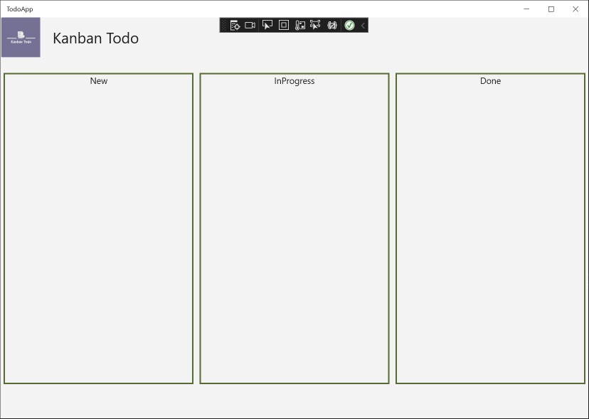
It does not look very beautiful but it should show where we are going. One thing maybe comes into your eye: The InProgress state should be two separate words. There are multiple ways of tackling that. Or one could argue you don't want to tackle this at all, because those enum "key's" can be used for translation. If you want to get rid of this you can either write a small converter described here or use something like EnumValueObjects which I described in an earlier blog post. Maybe I will implement this later on, lets see 😉.
Adding a todo item
All of this fancy stuff does not make much sense, if we can't add a new todo item in the first place. To do so we will give the user the possibility to add a new item via a nice floating button in the bottom right corner. On click it will open a new dialog which will allow us to enter the basic information and afterwards put the todo item into the New Swimlane.
Let's start with the button. Just add a new user control as described above named AddTodoItem. For the button itself I will use a image from here.

As our "logo" I also put this image in our Assets folder with the name AddTodoItem.png. Now we just need a button with the correct styling. I also mentioned we want to have a floating button. That basically means the button itself should always appear on the same spot independent of other factors or element. For that we are using the RelativePanel (in css / html that would be position: relative). So our button will be put relative to another element. We will use the bottom right of our Swimlanes.
Now the button first. We are using an ImageBrush as button background to draw the image. That has a nasty issue, when we hover over the button the image will disappear. We will tackle this later.
AddTodoItem.xaml
<UserControl
    x:Class="TodoApp.AddTodoItem"
    xmlns="http://schemas.microsoft.com/winfx/2006/xaml/presentation"
    xmlns:x="http://schemas.microsoft.com/winfx/2006/xaml"
    xmlns:local="using:TodoApp"
    xmlns:d="http://schemas.microsoft.com/expression/blend/2008"
    xmlns:mc="http://schemas.openxmlformats.org/markup-compatibility/2006">

    <Button Width="64" Height="64" HorizontalAlignment="Stretch" VerticalAlignment="Stretch">
        <Button.Background>
            <ImageBrush ImageSource="ms-appx:///Assets/AddTodoItem.png"/>
        </Button.Background>
    </Button>
</UserControl>
And the usage inside our MainPage.xaml:
</Grid>
    <RelativePanel Background="AntiqueWhite">
        <local:AddTodoItem RelativePanel.AlignTopWithPanel="True" RelativePanel.AlignRightWithPanel="True" Margin="-128,-128,0,0"/>
    </RelativePanel>
</StackPanel>
The </Grid> part is the last line from our Swimlane. Now let's compile and have a look:
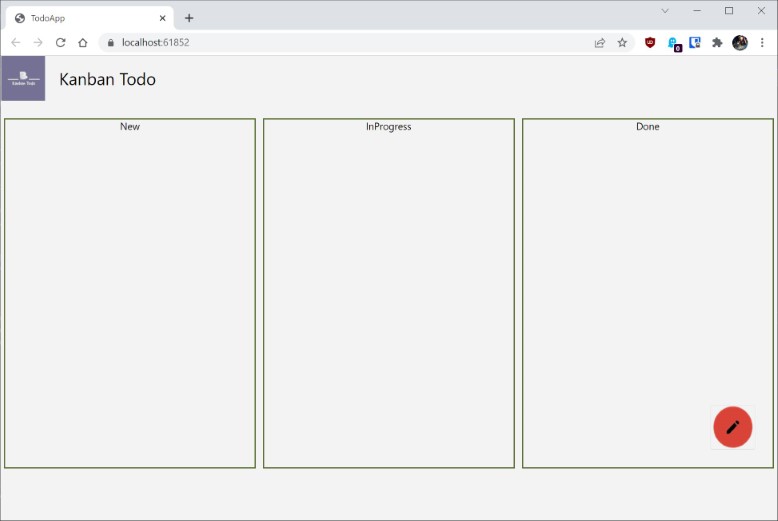
Let's wrap that up. Visually not the most appealing thing, but that does not matter right now. We can see the outline where we want to go. Now it is time for the first interactions!
What's next
We created a small app which shows us a TitleBar our Swimlanes as well as (in theory) the ability to add a new todo item via a floating button. But for now there is no logic at all. The user has no possibility to add a todo item, let alone moving those items around as you would expect from such an app. But don't worry. In the next episode we will take care of that as well.